Stop Publishing Web Pages
Most users on the web spend most of their time in apps. The most popular of those apps, like Facebook, Twitter, Gmail, Tumblr and others, are primarily focused on a single, simple stream that offers a river of news which users can easily scroll through, skim over, and click on to read in more depth.
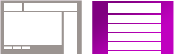
Most media companies on the web spend all of their effort putting content into content management systems which publish pages. These pages work essentially the same way that pages have worked since the beginning of the web, with a single article or post living at a particular address, and then tons of navigation and cruft (and, usually, advertisements) surrounding that article.
Users have decided they want streams, but most media companies are insisting on publishing more and more pages. And the systems which publish the web are designed to keep making pages, not to make customized streams.
It’s time to stop publishing web pages.
But I’m Reading This On A Web Page Right Now!
Obviously, I’ve written this in an old-style content publishing system, and this piece lives on my website as an old-fashioned HTML page. But if I had my preference, I’d write up an article like this, and it’d seamlessly glide into a clean, simple stream of my writing, organized by topic and sorted with the newest stuff on top. Blogs have always worked this way, but they were shoehorning this stream-like behavior into the best representation possible under the old page model.
I don’t have a tool I can use to run my website which will output a stream that works the right way. “What about using Tumblr to publish your blog?” you ask. Well, besides the fact that my site would have to run on their infrastructure, individual tumblr-style blogs don’t allow you as a reader to personalize or customize the types of content in the stream, the way you would be choosing people to follow on Tumblr, Facebook or Twitter. You can’t choose to follow just the music-related posts on my blog, ignoring the ones about technology.
This isn’t just about how the content looks, it’s also about how it works. The smart, responsive, dynamic apps most of us use on the web everyday have all kinds of subtle but powerful bits of functionality which appear as we hover or click on items in a stream. Meanwhile, our pages are still piling a row of awkward-looking share-button cruft at the bottom.
Also: Dollars
The vast majority of advertising online is dependent on a page-view model that users have overwhelmingly decided to abandon. Facebook, Twitter, Tumblr and others will succeed by making in-stream advertisements that fit in with the native content of their networks. Meanwhile, page-based sites are cramming every corner and bit of white space on their sites with ads that only ever decrease in effectiveness until they are made even larger and more intrusive every few years.
Stream-based content naturally flows across different devices and media, from tiny phones to tablets to giant desktop monitors, with an adaptivity that works naturally hand-in-hand with responsive design. Page based ads basically have to be reimagined on each platform, and fundamentally don’t work in mobile form factors.
Streams of content can easily be read in friendly native apps on mobile platforms with the content flowing through simple APIs. Pages get squeezed into faux-mobile app experiences that look just enough like native apps to be frustrating and annoying when they don’t perform correctly. Pages tell users there’s no mobile version of this story available, or accidentally redirect an interested user to the site’s homepage, from where they quickly depart. Pages stop your flow.
Let’s Fix This
So: Start publishing streams. Start moving your content management system towards a future where it outputs content to simple APIs, which are consumed by stream-based apps that are either HTML5 in the browser and/or native clients on mobile devices. Insert your advertising into those streams using the same formats and considerations that you use for your own content. Trust your readers to know how to scroll down and skim across a simple stream, since that’s what they’re already doing all day on the web. Give them the chance to customize those streams to include (or exclude!) just the content they want.
Pay attention to the fact that all the links you click on Twitter, on Facebook, on Pinterest, all take you to out of the simple flow of those apps and into a jarring, cluttered experience where the most appealing option is the back button. Stop being one of those dead-end experiences and start being more like what users have repeatedly demonstrated they prefer.
And if you’re smugly thinking “oh, we’re an app — he’s only talking about publishing content, so we don’t have to pay attention”, then you should get to work, too. Except for power tools which need to make use of the screen in a particular way, most of our other apps are going to be rearranged into streams, too.
Further Reading
- From ten years ago, Stories and Tools (Michael Sippey, now Twitter’s head of consumer product, liked this piece so much back then that he republished it.)
- At Activate, we created a presentation called “What Matters” at the end of last year; It starts by offering some data about use of page-based sites vs. stream-based sites by web users.