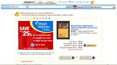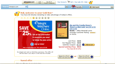
100 Perfect Pixels: Amazon's Gold Box
This is the second post in a series where I’m pointing out some nice little touches that take up less than a 100×100 pixel square on a screen. Today’s is the Amazon Gold Box.
It’s been four years since the introduction of Amazon’s Gold Box, and there’s still almost nothing like it on the web.
One of the frequent criticisms of web navigation is that it eliminates serendipity, or that it makes it difficult to stumble across a “find” in the way that you might while browsing a physical space. The Gold Box was introduced in 2002 and helped solve that problem by introducing some randomness into the Amazon shopping experience. Of course, it did so by focusing on items that they were trying to clear out of their warehouses, but that’s a tactic as old as retail itself.

Best of all, the combination of a whimsical name, a home page icon that was animated with a little shake, and the urgency of having to beat the clock to choose your items all combined to introduce a sense of play into what could have been a simple trip to the bookstore. It’s a remarkable enough archievement that even today, four years later, almost no one has come up with something similar on a commerce site on the web.
Resources:
Updated: Web Archive links for the posts referenced below have been added. It’s amazing how many links rot after four years.
- Jane Pinckard had a great open letter to Jeff Bezos (original, defunct link) about the ridiculousness of the Gold Box’s original suggestions. I’d linked to it on my own site back in the day. Web Archive link is forthcoming.
- Lia also showed off how funny the Gold Box could be back in 2002, complete with a mention of the then-little-known Hilton sisters. She mentions Rael’s poem, which is worth the read. (original, defunct link)
- I posted a notice when Amazon started explaining the feature, and suggested that Amazon’s addition of feeds should have included the Gold Box as well.
