100 Perfect Pixels: Vox Neighborhood
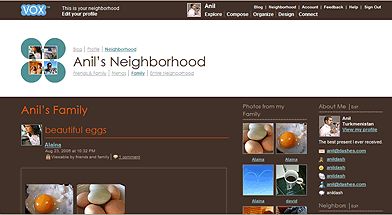
This is the third post in a series where I’m pointing out some nice little touches that take up less than a 100×100 pixel square on a screen. Today’s is from the Vox Neighborhood page.

Sure, Vox is still in preview. Sure, I work for the company that makes it. There’s still one little detail that absolutely bears pointing out for being an extremely thoughtful touch.
Vox carries on two well-established traditions for networked communications sites. The first is representing users with a small, changeable icon next to their name, as most of us are familiar with the concept of an avatar or profile picture. Then there’s the ability to aggregate all of your friends’ posts into a single view, which is an innovation that LiveJournal helped popularize years ago.
The combination of those two things makes my Neighborhood a very personal, human space for me to read about what’s going on in people’s lives. But the small touch that really made the page work, to me, was that there were four tiny profile pictures in the corner.
Where so many services would have had a generic “network” icon, maybe with a globe or a sphere indicating this was my world of friends, I was really pleased to see the Vox team put the faces of my actual friends in the page to illustrate where I am. It even updates the people to reflect whomever’s posted most recently.

That’s what 100 Perfect Pixels is all about, a little touch that takes something from sufficient to really delightful. And the Vox Neighborhood is exactly what inspired me to start this series of posts in the first place.
Resources
- Naturally, you can take a look at my Vox neighborhood.
- Not a Vox member yet? Ask for an invite.
- Vox also inspired me to write about Making Something Meaningful.
- See the other posts in this series of 100 Perfect Pixels: Amazon’s Gold Box, and Nike Plus